
Thursday, 15 December 2016
Thursday, 17 November 2016
media feed back
Tasks that need to be on your blog
• Audiences
Task- Create an audience profile for a magazine using Photoshop and upload
• Analysing
a Magazine cover
I know you have started this and you just need to finish
and publish
WWW
1) I am
impressed that you have started trying to use Media language accurately – such
as picking out connotations and the effects of the camera shots in the editing
task you completed on Home Alone and the ‘Central Image’ in the Diary of a
Wimpy Kid poster. Please make sure that you put any media words you have used
in your blog in BOLD so that I can see where you have become confident using
these new terms.
2) You
have often got onto the extension tasks which shows commitment to the work.
Make sure you are completely up to date though before you publish something.
EBI
1) For
your LIAR task on Diary of a Wimpy Kid poster – you have written only one line
for each thing. Media Language (the L) includes all the visual images you can
see and the mise-en-scene in the poster (props, character, costume, setting) so
make sure you say something about each thing. Representation is about which
groups of people (gender, age, race) are on the poster. Can you change this now
that you are more confident in these areas? Use my example if you need to and
your notebook.
2) Please
upload the missing work for target audience. When discussing target audience,
see if you can be specific about DEMOGRAPHIC and PSYCHOGRAPHIC so that I can
tell you know the difference. Look at your notes whenever you are tackling a
blog task as that is what your media book is for!
3) Please
check your spellings and proof read your work for checking spelling and sense.
Some basic words are spelled incorrectly such as ‘Magazine’ and ‘Audience’ when
they are right there in your blog titles and you have copied them off the board
so please copy words correctly. Tip- write your blog posts on WORD documents
first and then copy and paste once you have spell checked.
Learner Response
1) Copy
and paste the above WWW and EBI into a new blog post entitled ‘Responding to
Blog Feedback’
2) Please
finish all work that is not finished and publish it.
3) Write
a paragraph telling me what you have found interesting so far in Media and what
has been your favourite task. What do you think you have done well in?
4) Write
a paragraph telling me what you have found difficult so far in Media and what
has been your least favourite task. What skills do you think you need to
practise?
5) Write
a new blog post entitled ‘My Photo Shoot shopping List’ where you write down
all the props and costume that you need for next week’s photo shoot. What
camera angles will you use and who is going to be your model? What pose will
they be in?
Tuesday, 8 November 2016

Tuesday, 25 October 2016
Assignment 1- The Magazine Cover
- -A bold, snappy title reflecting the ethos of your magazine in the top third. What is your title?My tittle is going to be called ICON
- This suggest to the audiance,how to be iconic in the fashion world as the magazine is about fashion,
2 -Rule of thirds- how will you use this? I'll put the tittle on the top 3 squares .
3-A tag line linking to your title - what is this and how will it link to your title?
"the path to being iconic in fasnion" ,This links to the tittle "icon" means how to be worthy of great respect ,in this magizine in fasion ,and that's how the tag line links with the tittle.
4-A strong central image using a medium close up / close up / medium shot (no bigger than this and no more than two people; strongest covers use one) What is this image going to show? ther'll be one central image, this image will show the audiance how to bold and iconic.
5-A colour scheme of three main colours which signify certain connotations you want your target audience to take away with them . my colours would probably be pink purple and red because the demographic would be teenage girls,
6-The letter 'i' and the word 'free' as this is a supplement with the 'i' newspaper- where is this going to be included? (eg will you incorporate it into your title?) I'll include the "i" in the tittle.The part that'll say it's free would be on the bottom right.
8 Three or four 'flashes' or secondary cover lines telling the reader in short phrases (without connectives) what will be in the magazine. There should be a theme running through these stories that works with your overall ethos. FLASHES-where did Rhianna get the idea from of her 2015 Met Gala look .
- tips
-
-
9 Perhaps a competition ,winnining a iphone 7 if you buy the i news papper.
10 -Perhaps a strap line at the top and / or bottom of the cover to make it look stylish and clean.
- I'd put the strap on the bottem ant it'll have social media logos where to follow ,because the target audiance are teenagers
11-Font choice should be consistent and bold and eye-catching (no hard-to-read fonts please or ones that resemble handwriting!) The font should be in bold as it will stand out more to the audiance
12,Some links to social media or something that suggests that the target audience can engage with your product on more than one media platform. I would use some links like twitter,instagram and facebook too engage with my target audiance teenagers and they usually follow these sights.
Wednesday, 19 October 2016
Representation
1) Find a POSITIVE (conventional) representation of young people and write a paragraph explaining why it is positive.
one positive thing is that they warned where everything was happening on the news so adults ,children and family could keep safe and out of danger . It shows the police and the governments views and it helps them on how they can improve because one of the late teens called Danial said "they make things harder for us like getting a job." He means its harder for curtain groups in society to get jobs. This is positive because the government can improve on this.
2) Find a NEGATIVE (conventional) representation of young people and write a paragraph explaining why it is negative.
The police was treating the young people like criminals even though some of them were innocent, At the end the lady called jade and brother (who kept getting checked by the police ) felt hassled,bullied,This is negative as not all teenagers or children go around wanting to cause damage and what the police are trying to say is all kids who are in groups or dressed in a curtain way are the ones that are causing the damage and that's not true because some kids don't choose to do that type of stuff.
Positive and negative representation of young people

This picture denotes of black and white males staring at the camera and connotations of this is it's quite intimidating . If the viewer was elderly they'll think how intimidating these teens are now in today's generation.

children and adults are helping with broken window in the background after the riots . The connotation of this shows how young people can be good ,this shows the viewer not all kids are "intimidating" and bad .
Wednesday, 12 October 2016
audiance profiles
1)teenage boys who are sporty
This advert is about teenage boys who are sporty and like trainers and i know this adverts about boys because the colours are quite dark which has connotations of masculinity. In addition, boys are in the advert doing well at dancing.
2)Men in their 30's who care about what they look like
I know this is about men who care about what they look like because in the beginning there's a man who's around that age who cares about his apearance as he' s wearing a suit and this will atract other middle class men who may want to be like the man in the advert .
)Mothers
This is for middle class women who can afford pampersfor their children and moters love when their children are happy and the pampers advert shows how happy thrir children would be with pampers.
 old people with disposable income to go on holidays
middle class old people who have worked for their pention money would book to be on a ship like this to have fun while they're still able to do these actiivities .
families who like spending time together
this is an oak furniture land advert and thos is aimed at working family i know this becauese the dan afford that christmas dinner and the table .The advert will atract these big familys to shoy that there's enough space for everyone ,in this there is a mix of colours becuse this advert can be for anyone.
This advert is about teenage boys who are sporty and like trainers and i know this adverts about boys because the colours are quite dark which has connotations of masculinity. In addition, boys are in the advert doing well at dancing.
2)Men in their 30's who care about what they look like
I know this is about men who care about what they look like because in the beginning there's a man who's around that age who cares about his apearance as he' s wearing a suit and this will atract other middle class men who may want to be like the man in the advert .
)Mothers
old people with disposable income to go on holidays middle class old people who have worked for their pention money would book to be on a ship like this to have fun while they're still able to do these actiivities .
families who like spending time together
Monday, 10 October 2016
cuts and transitions
.Cut away ,when your filming something and then another object interupts and then it goes back to the first image
.Cross cut . when you do a series of scenes and re-order them.
.Jump cutis in film editing whe two shots of the same subject are taken from slightly differen camera angkles.
.Match cut is a shot from une shot that matches with another where the two shots are matched by the action
.Fade in and fade out transition -the fade out is also called the fade to black and fade in are use to describe a transition to and from a blank image.
.dissolve transion - Dissolve transition is a gradual transition from one image to another.
home alone
.in the beginning thet used a fade away to add a bit of tension because u want to see what the movie is about
the pace of the transitioning in the middle was very fast to show bits of whats going to happen
.The close up was one of the most common shots so that the audiance can see their facial expressions.
.They also do alot of wide shots as alot of action is happening and the wide shot show it all.
.They also used quite a bit of medium shots to show therre movements and their face is clearer so the audiancecan see there face expressions.
Thursday, 6 October 2016

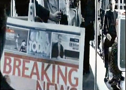
This is an over the shoulder shot it shows a man looking at the news paper and another man sitting on the train .This might suggest the man sitting n the other side is the one in the news paper as hes sitting quite nervously .

This is a wide shot it's a bit mysterious because we don't know who's getting out the car and the persons face is a bit blurred . This might mean that something bad is happening
Monday, 3 October 2016
story board

This image shows a girl walking through a corredor whit two other girls looking at her.This could indicate that the other girls are talking about her.

This image shows two girls laUghing at the other girl. She is standing by the railing which shows she has nowhere to go. This is a school setting.

This is a birds eye view. This view makes the girl look smaller and it could also be how she feels. It helps the person viewing this image understand how she feels.

Lastly, in this image we can see the girl is starting to cry. The close-up shot shows that she is crying. The shot shows half of her face this makes the picture look dramatic.
Saturday, 24 September 2016
1) Which do you think worked most successfully as a design? Why? I liked fruit bowl number one more because of the bright colours .
2) Show your fruit bowls to the person next to you and get a WWW and an EBI feedback point from them. Write this on your blog with their name.
3) What have you learned about Photoshop? Write out the instructions for another student who has not used Photoshop before. This will help you to revise the skills you have learned. Photoshop is a bit like paint because the colours will always be on the side it has the paint bucket but it allows you to copy and paste pictures from the internet and when you do that you can get some of the colours from that picture using the eyedropper you can even mix colours together using the brush
4) Pick 5 colours and google the CONNOTATIONS of these colours. Add this information to your blog. Associated with danger
 the colour purple is often associated with power and wealth
 This is usually associated with calmness.
 this colour is quite a worm colour as it's near to the colour red
this colour is quite a neutral colour and associated with winter
2) Show your fruit bowls to the person next to you and get a WWW and an EBI feedback point from them. Write this on your blog with their name.
3) What have you learned about Photoshop? Write out the instructions for another student who has not used Photoshop before. This will help you to revise the skills you have learned. Photoshop is a bit like paint because the colours will always be on the side it has the paint bucket but it allows you to copy and paste pictures from the internet and when you do that you can get some of the colours from that picture using the eyedropper you can even mix colours together using the brush
4) Pick 5 colours and google the CONNOTATIONS of these colours. Add this information to your blog.
Associated with dangerthe colour purple is often associated with power and wealthThis is usually associated with calmness.this colour is quite a neutral colour and associated with winter
Thursday, 22 September 2016


Tuesday, 20 September 2016

Sunday, 18 September 2016

.The colours used for this are red and blue . This connotes that the film must be for boys and especially teenage boy .
.The tittle looks drawn by a kid this suggests that the target audience they are aiming for are kids . .The main character on the movie poster is a kid ,I can tell this as the boy wearing a rock sack . The paper in the back gives a scruffy feel therefor ,the boy is not dressed smartly.
.I can tell this is about a diary as as the back ground is like a note book also like a note book the tittle is in a bold font "wimpy kid" this tells us the boy in the central image is weak as wimpy means weak.The cartoon drawing looks very weak and upset as the backs sort of hunched .
he is white middle class school boy so this will attract white middle class school boys.
Subscribe to:
Posts (Atom)